A sticky header can look perfectly tidy while hiding the link someone has reached with their keyboard. A form can have clear labels and still ask a person to remember information they entered three screens ago. A login page can support a screen reader while blocking the password manager its user depends on.
These are the kinds of barriers WCAG 2.2 addresses.
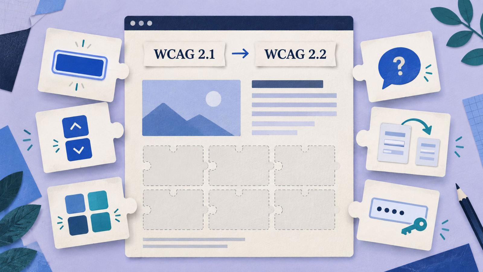
Moving from WCAG 2.1 AA to WCAG 2.2 AA introduces six additional success criteria: two at Level A and four at Level AA. There are nine additions overall; the remaining three are Level AAA. WCAG 2.2 also removes the old Parsing criterion. W3C’s overview of the changes.
For a team planning accessibility work, the useful question is how those six requirements affect the menus, forms and services people already use.
The legal requirement and the build target
The U.S. Department of Justice’s ADA Title II web rule specifies WCAG 2.1 AA for covered state and local government websites and mobile apps. HHS’s Section 504 rule also specifies WCAG 2.1 AA for covered recipients of its financial assistance. Those are particular regulatory requirements; “the law requires 2.1 AA” is too broad a statement to apply to every organization. DOJ guidance, HHS guidance.
WCAG 2.2 is the latest published W3C Recommendation in the WCAG series. It has also been adopted as ISO/IEC 40500:2025. That adoption does not automatically change a regulation or contract that names an earlier version. W3C’s ISO announcement.
Our approach is to build toward WCAG 2.2 AA while keeping the applicable legal and contractual requirements explicit. W3C recommends adopting 2.2 even where formal obligations reference earlier versions. WCAG 2.2 specification.
The nine new criteria: a working checklist
These are starting tests for a review. Follow the linked criteria for their full conditions and exceptions.
| New success criterion | Level | One-line test |
|---|---|---|
| 2.4.11 Focus Not Obscured (Minimum) | AA | Tab through the interface: does site-created content ever completely hide the focused control? |
| 2.4.12 Focus Not Obscured (Enhanced) | AAA | Check that no part of the focused control is hidden by site-created content. |
| 2.4.13 Focus Appearance | AAA | Check qualifying indicator area against a two-CSS-pixel perimeter and a 3:1 contrast change between focused and unfocused states, subject to exceptions. |
| 2.5.7 Dragging Movements | AA | Complete each dragging action with clicks or taps alone, unless an exception applies. |
| 2.5.8 Target Size (Minimum) | AA | Check for targets at least 24 × 24 CSS pixels, or a valid spacing or other exception. |
| 3.2.6 Consistent Help | A | Compare pages with repeated help mechanisms: do they retain the same relative order? |
| 3.3.7 Redundant Entry | A | Repeat a multistep process: is previously supplied information populated or selectable when requested again, unless excepted? |
| 3.3.8 Accessible Authentication (Minimum) | AA | Check every authentication step for an alternative, assistance mechanism or permitted exception to cognitive tests. |
| 3.3.9 Accessible Authentication (Enhanced) | AAA | Repeat the authentication review without relying on the object-recognition or personal-content exceptions allowed at AA. |
AA conformance includes both A and AA requirements. That makes Consistent Help and Redundant Entry part of the upgrade, even though neither is labelled AA.
1. Keep keyboard focus clear of sticky headers
On a Drupal site, start with the shared header, mobile navigation, cookie banner and any floating contact panel.
Use Tab and Shift+Tab through a long page. Scroll, open the menu and repeat at a narrow viewport. If a sticky header completely covers the control receiving focus, it fails the new AA criterion.
Partial visibility can satisfy this particular minimum requirement. Keeping the whole control visible is a better design target and is addressed by the enhanced AAA criterion. Existing requirements for visible focus still apply.
A theme fix might reserve scrolling space beneath the header or change how a persistent banner behaves. Test the result with the banner present; a screenshot taken after dismissing it misses the problem. W3C’s focus guidance.
2. Give dragging a click-or-tap alternative
Consider a sortable list, a draggable carousel or a slider in a custom Drupal component.
Someone who can tap a button may be unable to hold it down while moving precisely. Provide another way to perform the same action: move-up and move-down buttons, previous and next controls, or a field for entering a value.
Keyboard support alone does not satisfy this addition. The alternative must also work with a single pointer without dragging. Exceptions include actions where dragging is essential and unmodified browser-controlled behavior. W3C’s dragging guidance.
Include the editorial interface when it is part of the project’s accessibility scope. Content editors need usable controls too.
3. Measure the clickable area in menus
A small chevron may sit inside a generous button, or it may be the entire clickable target. Those implementations look similar but behave very differently.
WCAG 2.2 AA generally calls for targets of at least 24 × 24 CSS pixels, with exceptions. These include sufficient spacing, equivalent controls, inline links, certain browser-controlled targets and essential presentations.
For undersized targets using the spacing exception, imagine a 24-pixel-diameter circle centered on each target’s bounding box. It must not intersect another target or the corresponding circle around another undersized target.
On Drupal sites, inspect submenu toggles, pagination, dismiss buttons and closely packed filters. Increase the interactive area through the shared component, then check adjacent controls. The requirement concerns CSS pixels and clickable geometry, not the dimensions of the icon file. W3C’s target-size guidance.
4. Make help predictable
A support link that moves from the header to a sidebar and then below a form makes people search for it repeatedly.
Consistent Help addresses repeated contact details, contact mechanisms, self-help options and automated help. Where these appear across a set of pages, keep their order consistent relative to other content.
This criterion does not require adding a chatbot or staffing a help desk. It governs the help mechanisms you repeat. Responsive layouts can differ, provided the relative order is consistent across pages in the same layout variation.
For Drupal, a reusable help block with controlled placement is easier to maintain than contact instructions pasted into individual pages. W3C’s consistent-help guidance.
5. Stop asking for the same information twice
An application asks for a mailing address. Two steps later, it demands the address again.
Within the same process, previously entered or provided information must be automatically populated or available to select when needed again. Exceptions cover essential repetition, security and information that is no longer valid.
For a multistep Drupal form, carry values forward or provide a “use the address already supplied” option. Browser autofill alone does not establish that the site has met this requirement.
The criterion does not require retaining someone’s information between separate sessions. Review the complete journey, including any handoff to a third-party service. W3C’s redundant-entry guidance.
6. Let people use their login tools
A password is not automatically a WCAG 2.2 failure. Requiring someone to recall or transcribe it without suitable assistance or an alternative can be.
Allow password managers and pasting. Check that verification-code fields accept a complete pasted code. Test recovery and multifactor steps as well as the initial login.
AA includes exceptions for recognizing objects and identifying non-text content the user previously supplied. Those exceptions do not make every CAPTCHA accessible. The enhanced AAA criterion removes them.
For Drupal, review the complete authentication flow, including contributed modules and external identity providers. A well-labelled local form cannot resolve a barrier on the next authentication screen. W3C’s AA authentication guidance, AAA guidance.
The removed criterion: 4.1.1 Parsing
WCAG 2.2 removes Parsing, the Level A criterion associated with markup syntax requirements.
W3C explains that modern browsers handle parsing consistently and that accessibility problems caused by markup errors are covered by other criteria. Updated guidance for WCAG 2.0 and 2.1 treats Parsing as satisfied for HTML and XML content.
Broken relationships between labels and fields still need fixing. Invalid markup can still produce inaccessible results. If a procurement report retains a Parsing row, document the applicable version and assessment treatment. W3C’s explanation.
How our build supports the target
This site runs Drupal locally and uses Tome to generate static pages. Before a release, our GitHub pipeline runs an accessibility audit on every generated page at phone and desktop sizes, including a 320-pixel reflow check. Responsive checks cover layout, text size and page weight; search checks cover titles, descriptions and links. A failed gate blocks deployment, and pull requests run the same gates without publishing.
That gives us repeatable checks before changes reach visitors. It does not establish that every WCAG 2.2 criterion has passed. W3C explicitly notes that evaluation tools cannot determine accessibility on their own. W3C’s evaluation guidance.
For a 2.2 assessment, the automated checks need a documented companion review:
- Navigate with the keyboard while menus, banners and dialogs are open.
- Exercise dragging alternatives with clicks and taps.
- Review target dimensions and any claimed exceptions.
- Compare help placement across templates.
- Complete forms through validation errors and repeated-information steps.
- Test authentication with password managers, pasted codes and recovery options wherever login exists.
Our public site has no production login page. An assessment should record that scope; an audit of its generated pages cannot establish the accessibility of the separate Drupal editing interface.
Why we build toward 2.2 AA
These changes belong in ordinary design and development decisions. A reusable menu can provide adequate targets. A form can carry information forward. A header can leave room for keyboard focus.
Addressing those details while changing the component avoids reopening the same work later. It also gives procurement teams concrete acceptance criteria: six requirements to assess, evidence to retain and identified owners for any remaining fixes.
Start with shared templates and the journeys people depend on most. Record which requirements pass, which need work and which do not apply. Keep the findings current as the site changes, and use the accessibility statement to explain the approach and provide a route for reporting barriers.
A visitor should be able to find help, finish a form and sign in without having to work around the interface. That is what these six additions help teams deliver.